About The Project
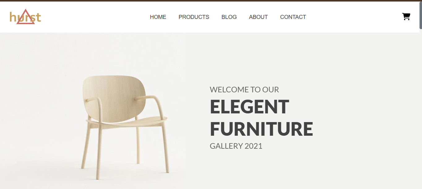
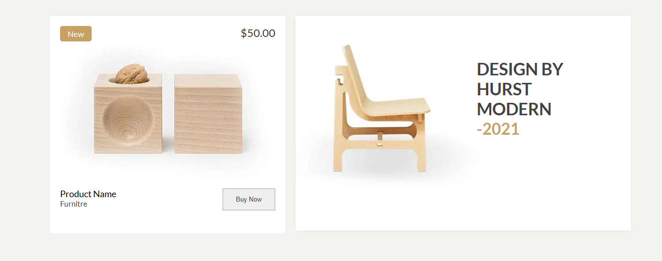
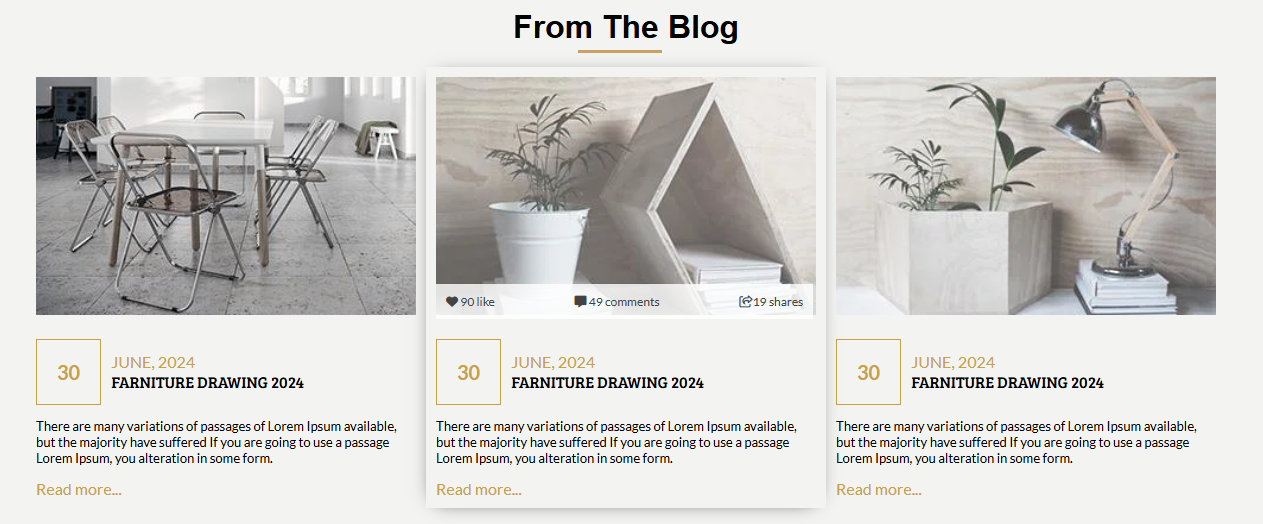
This elegant, multi-section furniture gallery was developed completely from scratch using purely HTML5 and CSS3. Unlike modern frameworks that rely on JavaScript, this project strictly tests fundamental web structuring and styling capabilities.
The core aspect of this codebase is its advanced modular CSS approach for tackling responsive design. Instead of cramming all media queries into a single file, the website employs uniquely distinct stylesheets separated by device screen-size bounds. This enables it to dynamically load specific stylesheets dedicated to particular viewports (like `iphoneXE.css` for mobile mapping and `hub_max.css` for large screens) alongside the primary aesthetic logic `main.css`.
UI Front-End Implementation Gallery